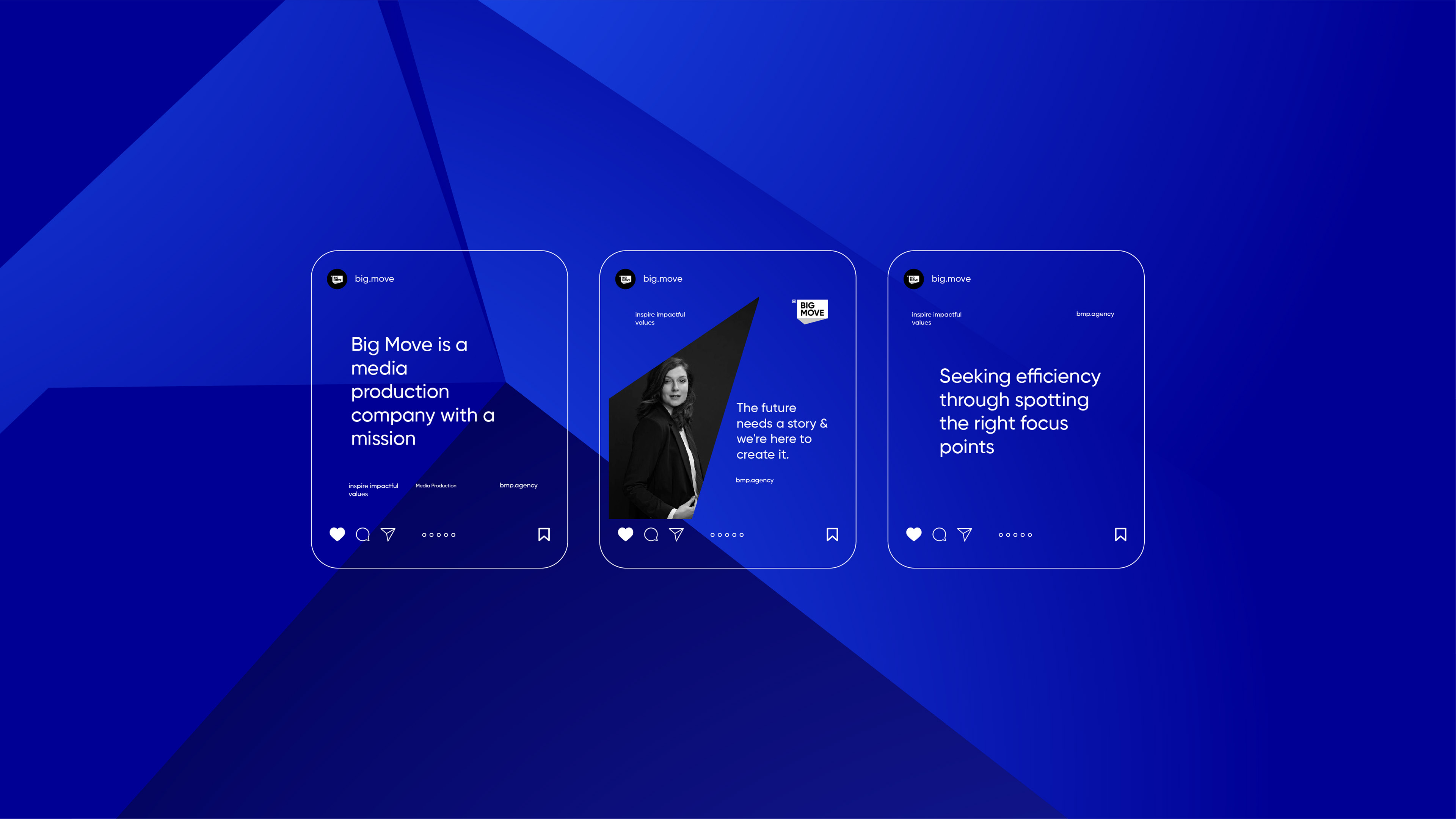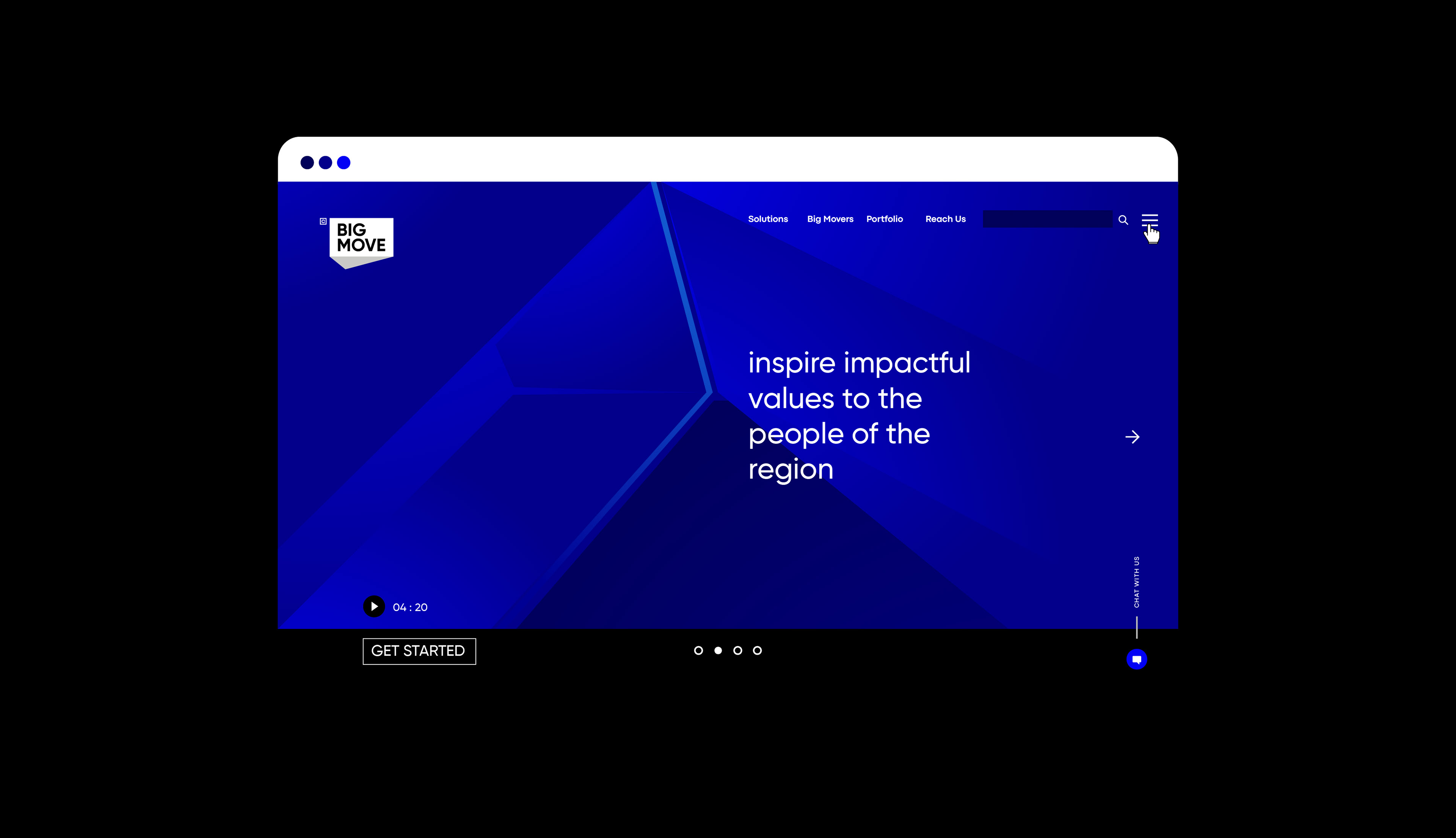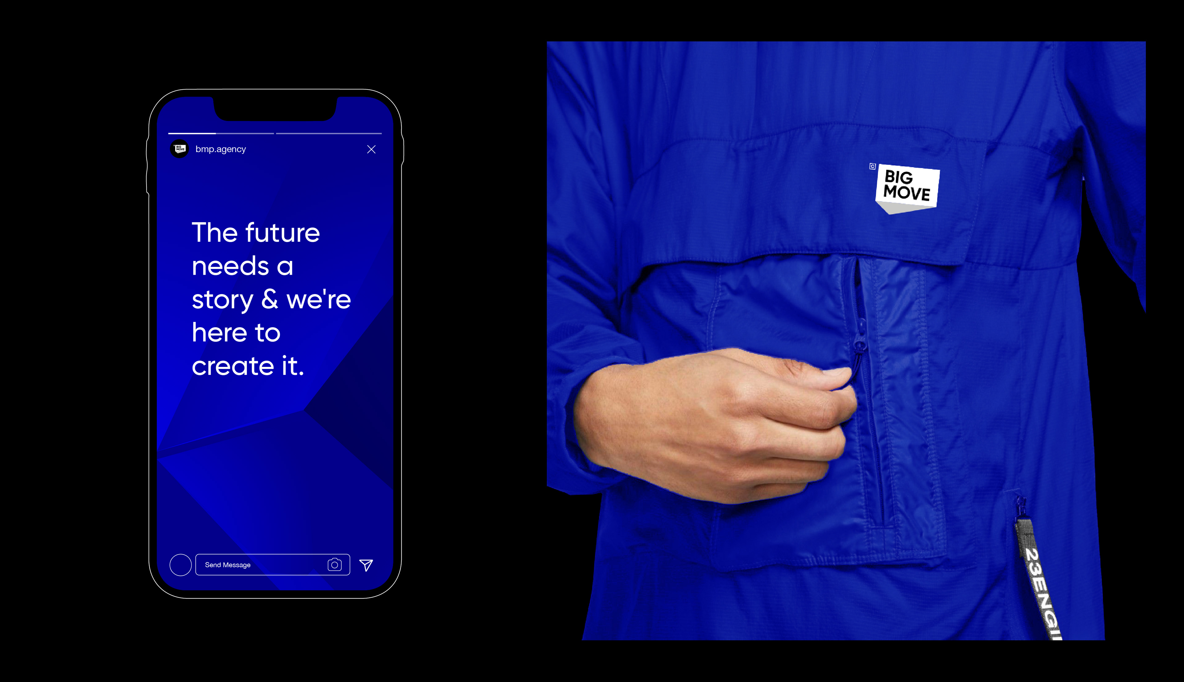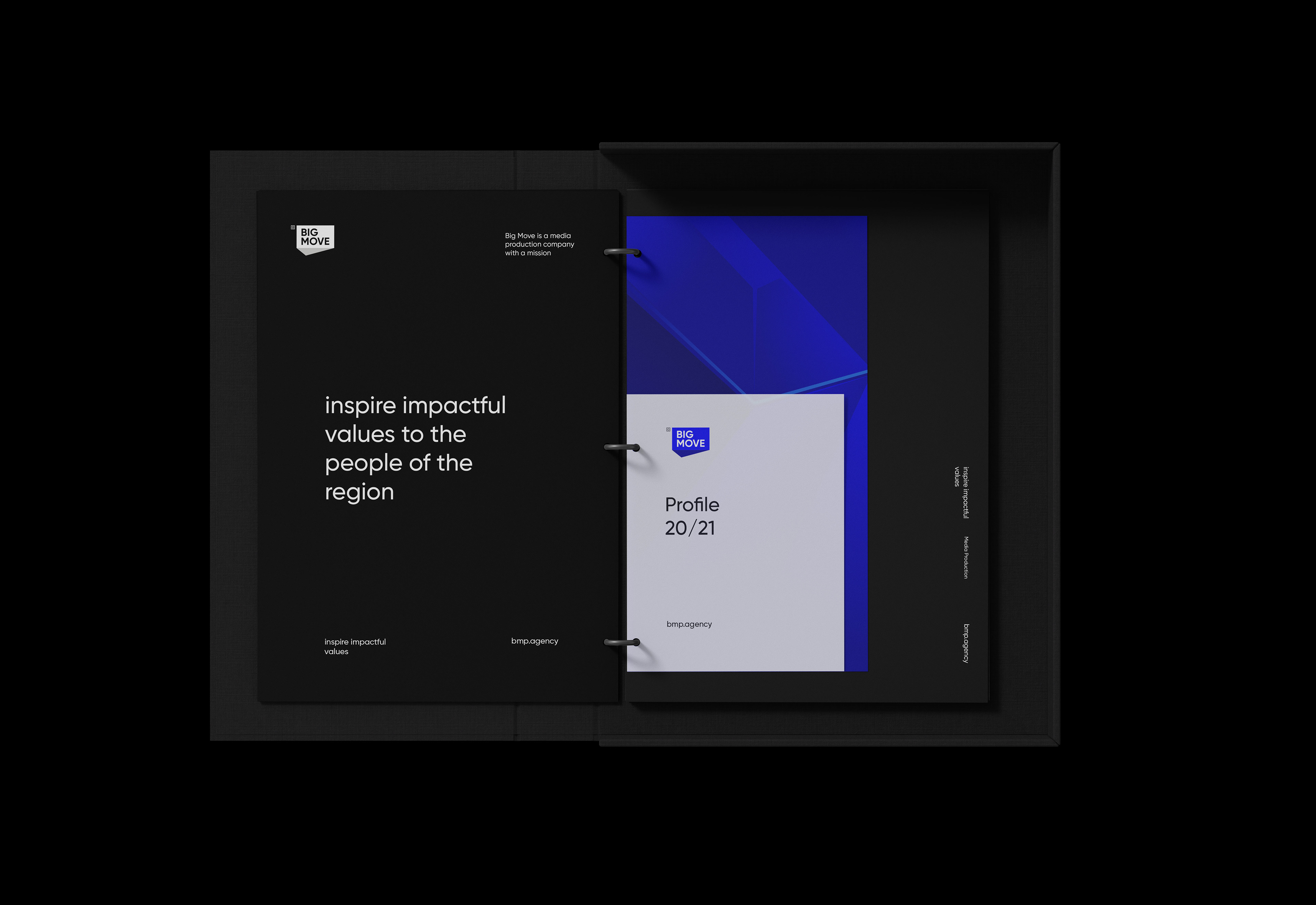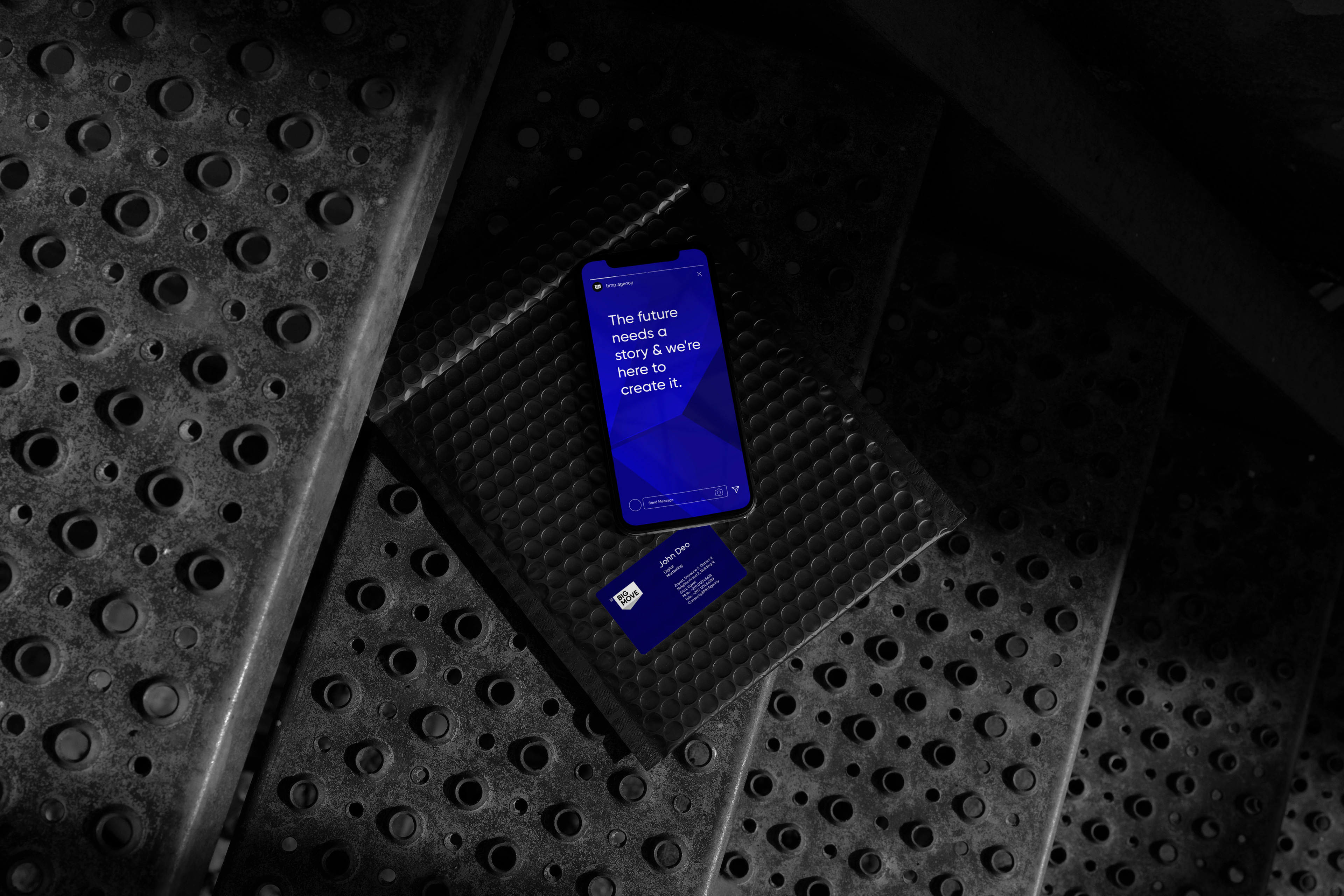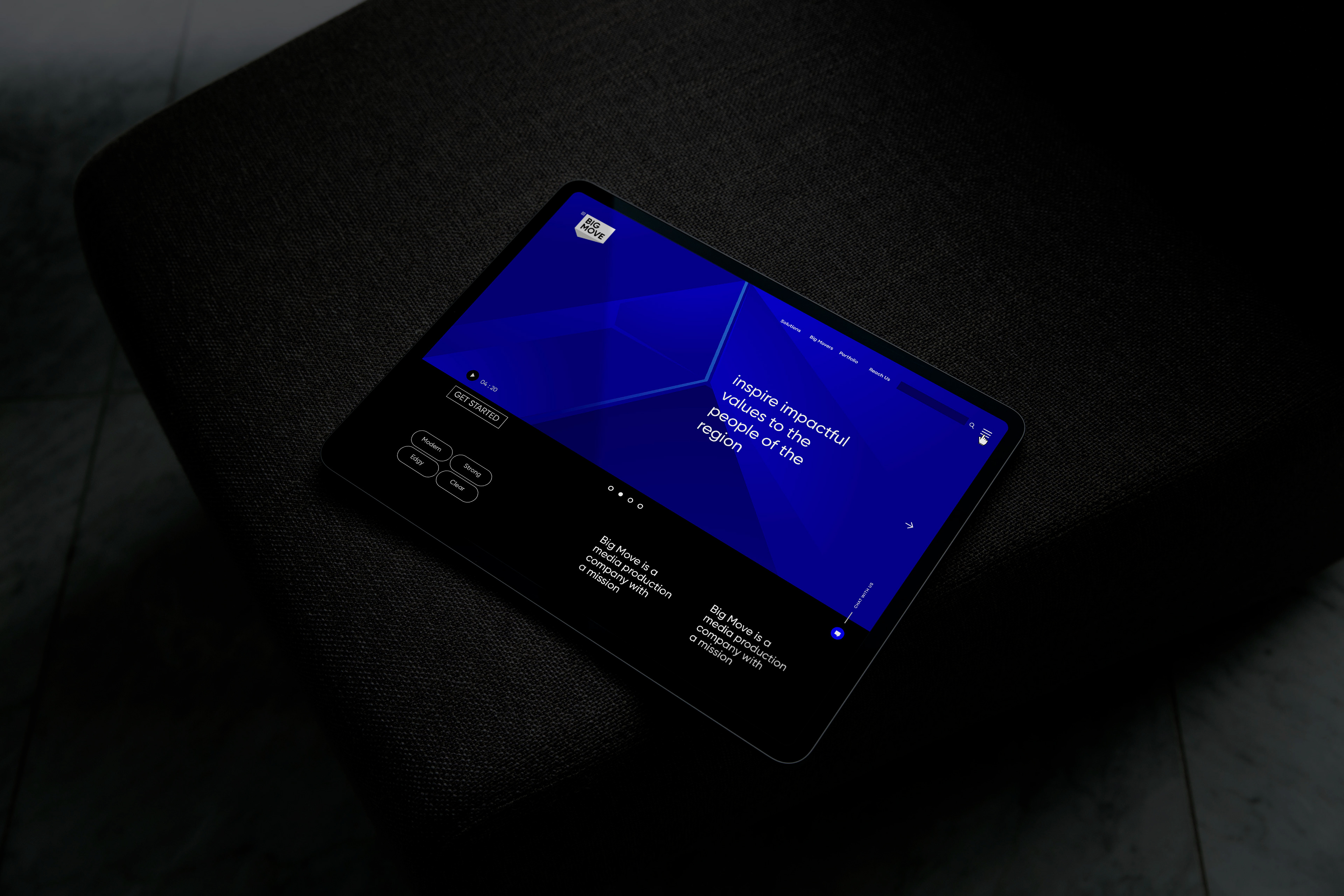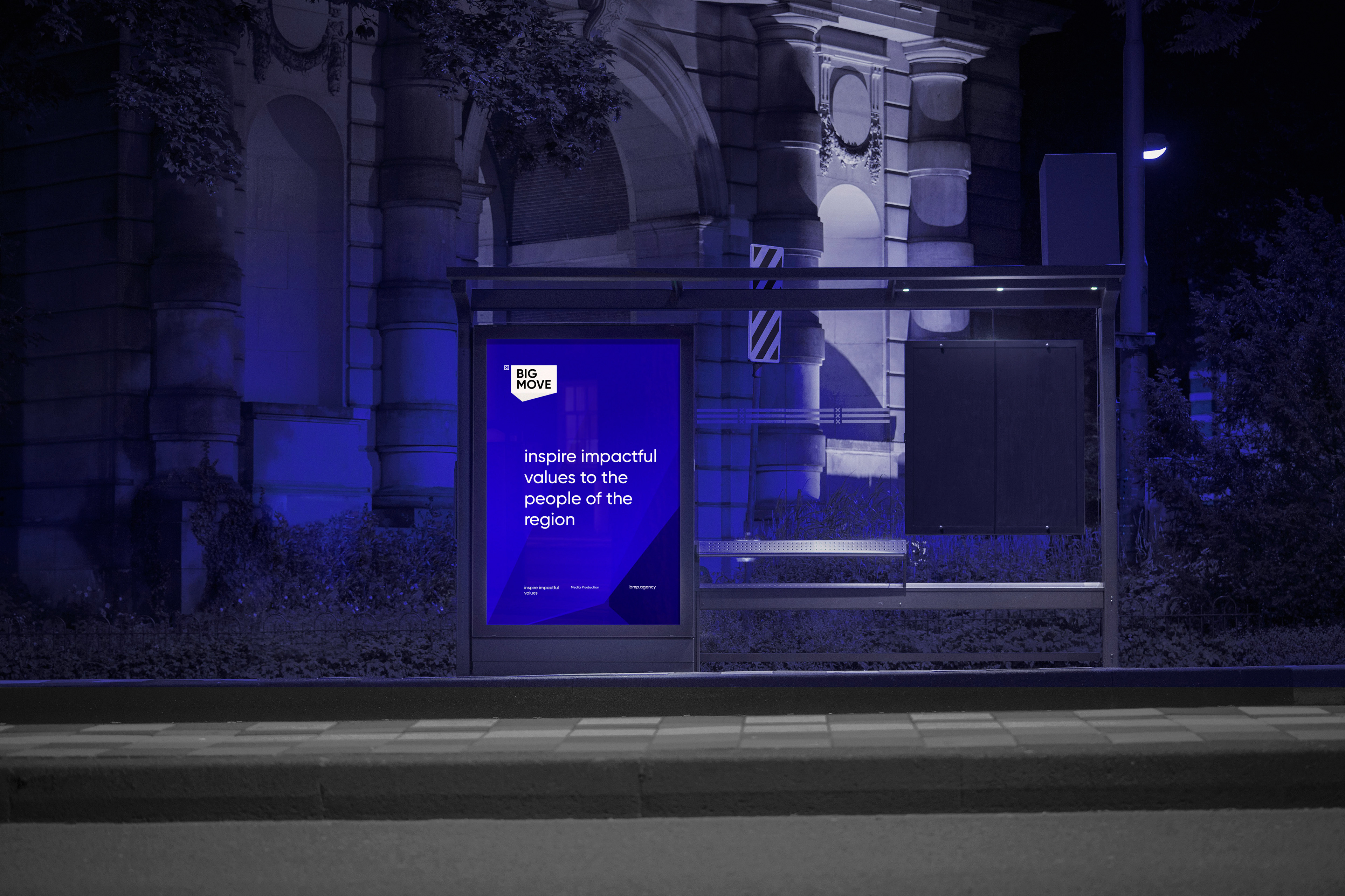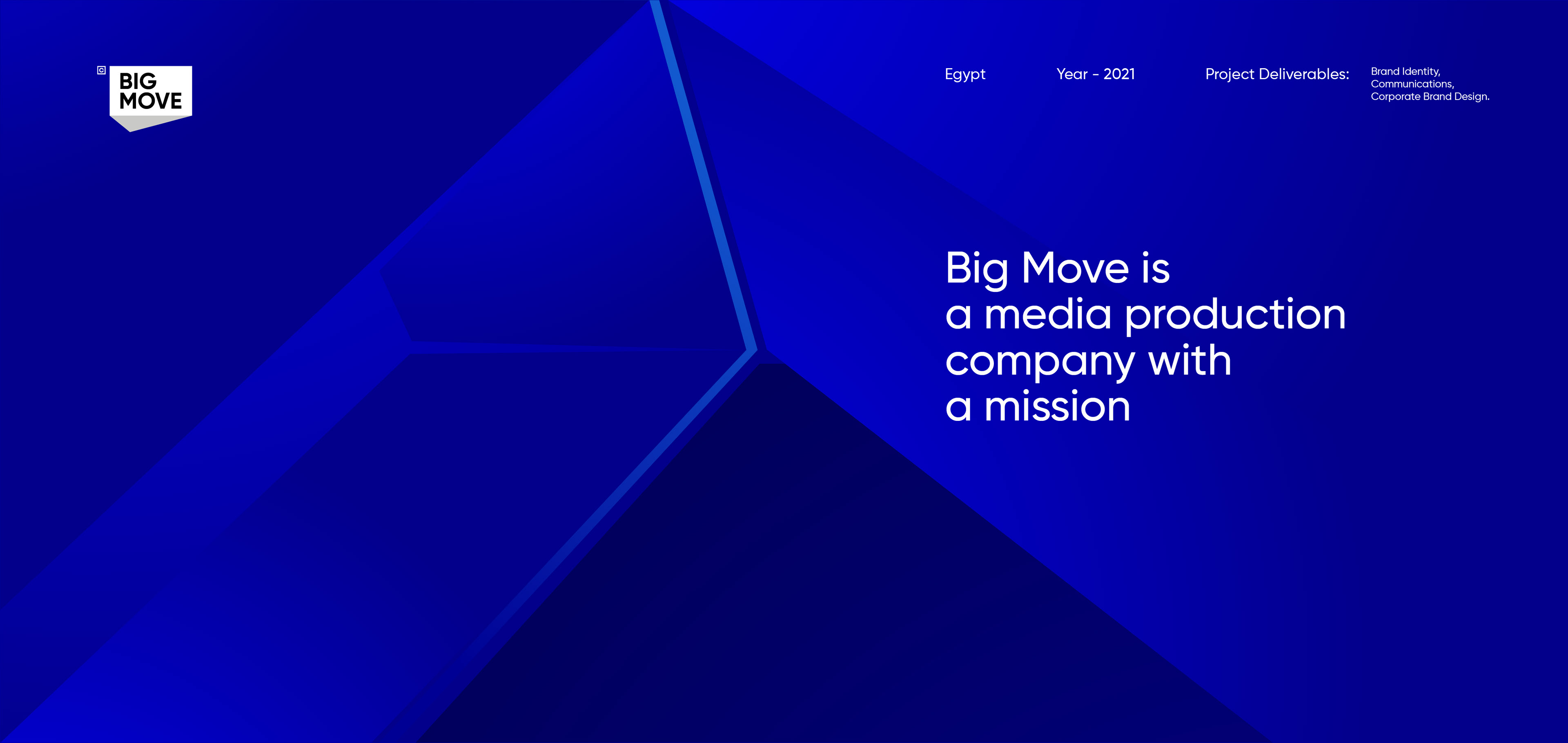
Big Move Production
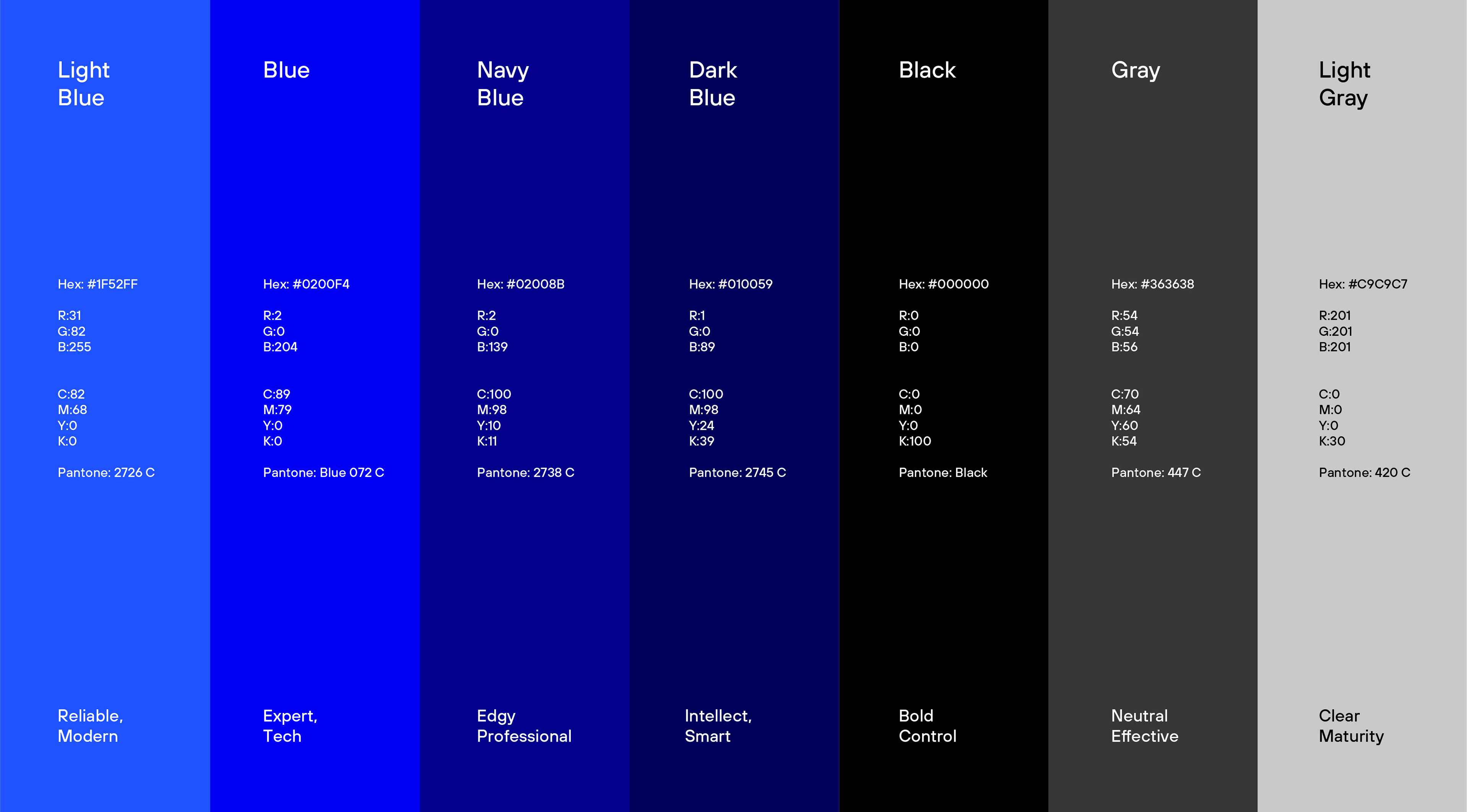
The logo features a stylized prism shape with rays of light emanating from it. The rays of light are depicted in white to symbolize clarity and creativity.
The typography for PRISM* is clean and modern, with a sans-serif font that complements the geometric shapes in the logo. The asterisk at the end of the name adds a playful touch and represents the idea that there is always more to discover and explore.
Overall, this logo concept for PRISM* communicates our commitment to generating innovative ideas that are diverse, dynamic, and full of potential. It captures the essence of our brand identity as a creative agency that helps businesses shine bright.
_
Year: 2021
Egypt
SOW: Brand Identity, Communications, Corporate Brand Design.